Finding the Best Color Scheme for Your Posters
How Color Palettes Help You Create Better Posters
Choosing the right color palette is key to creating a specific look and expressing a particular mood in your artwork, whether it's vibrant, exciting, or calm and meditative.
As Sarah Renae Clark explains in her insightful video (below), using a color palette can harmonize your design, making it more cohesive and visually appealing. It also simplifies the coloring process, reducing the stress of choosing colors while inspiring creativity.
A well-chosen palette can guide you toward achieving the desired theme or atmosphere in your Debbie Lynn poster.
Understanding Color Psychology for Your Posters
Choosing the right colors isn't just about what looks good—it's also about how colors make people feel. This is where color psychology comes in. Different colors evoke different emotions and responses, so picking the right shades for your poster can help convey the right message.
-
Blue: Evokes calmness and trust. Perfect for posters that need to feel professional or soothing.
-
Red: Creates excitement and energy. Use it for bold, attention-grabbing designs.
-
Yellow: Represents happiness and optimism. Great for adding a cheerful, sunny vibe.
-
Green: Associated with nature and harmony, making it ideal for eco-friendly themes.
-
Purple: Often linked to creativity and luxury. A good choice for artistic or high-end projects.
By understanding how these colors work together, you can create a poster that not only looks great but also feels right for your space.
Easy to Follow Tips
Use Complementary Colors
Complementary colors are a quick way to create contrast while maintaining harmony. They help draw attention to important areas of your poster without looking chaotic. This tip is particularly useful for posters that need to grab attention but still feel cohesive.
Limit Your Palette
A good rule of thumb is to use no more than 3-4 main colors in a design. Too many colors can overwhelm the viewer, while a limited palette maintains focus and cohesion.
Incorporate a Neutral Base
Adding neutral colors like white, gray, or beige into your design (or strategically keeping some areas white) can help balance bold colors. Neutrals provide breathing room and prevent your poster from looking too busy.
Now that you have more background about color, here are some sites where you can find great color palettes:
Coolors
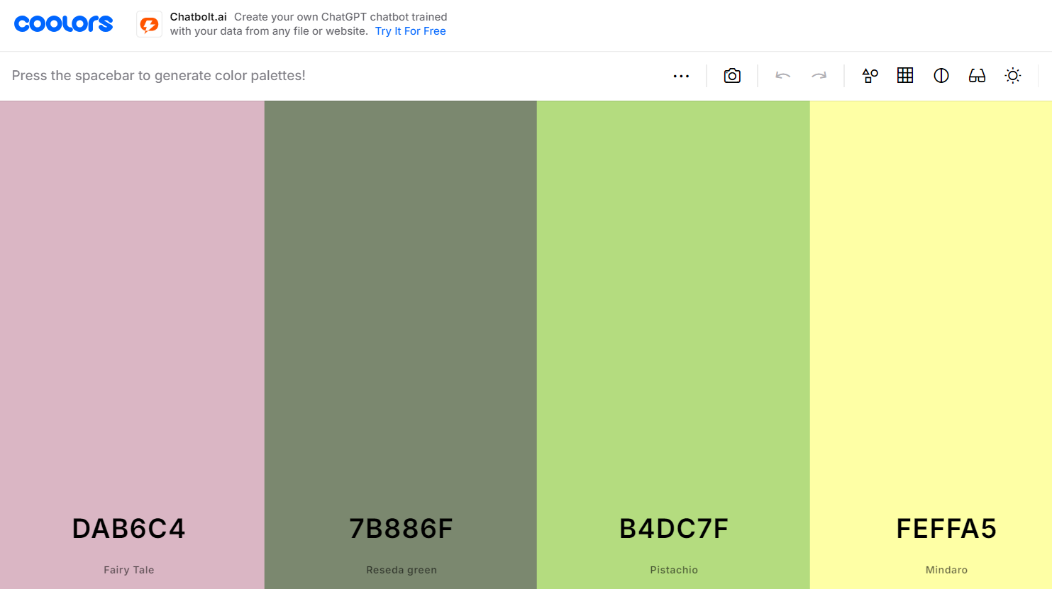
coolors.co - probably the best known resource out there. You can press the space bar on your keyboard or click the "Generate" button on the screen, and it will spit out random color palettes for you. For free!
But wait: It gets even better: if you like a certain color, but would like to see other combinations based on that color, you can lock it and ask the tool to generate a new palette based on that color.

Canva
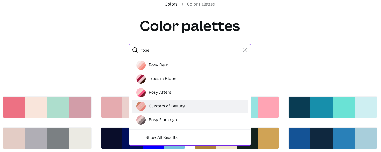
canva.com is one of the most versatile design resources out there. While it's not primarily focused on color palettes it has a great color palette tool. You can find palettes based on different keywords like this:

Sarah Renae Clark's Color Catalog
https://sarahrenaeclark.com/color-palettes
Helps you to break through creative block and create art with fresh ideas, exploring colors that you would never have considered otherwise. There are now 500 palettes included across 2 Volumes

Color Hunt
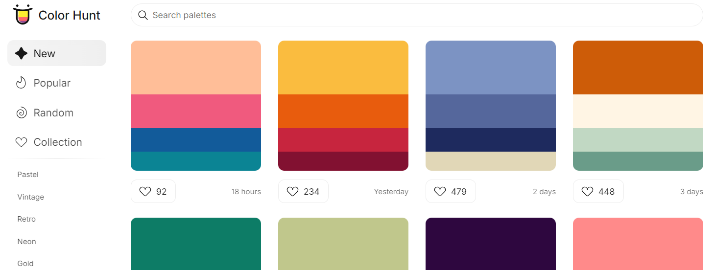
https://colorhunt.co/ - Tons of color palettes! You can start with the ones featured one the home page, search for a specific color you have in mind, OR, if you're feeling adventurous, click on the Random button at the left side of your screen and go with whatever pops up.
The search function will allow you to find palettes based on a season, mood, temperature, or whatever else comes to mind.

Choosing the right color palette for your coloring poster is an essential step in creating a visually appealing and meaningful piece of art.
By thoughtfully selecting colors that align with your theme and mood, you can transform a simple design into something truly captivating.
Whether you're seeking harmony, contrast, or a particular emotional impact, the colors you choose will play a key role in bringing your vision to life.
So, experiment with different palettes, trust your instincts, and let your creativity shine through every hue and shade.
Ready to explore some posters and start coloring? Click below to get started!
